The Pragmatists’ Guide to Marketing e-Mails.
By Tom Demerly.

I collect promotional e-mails. I love the medium. I’m fascinated by it. I love the good ones and am entertained by the bad ones. Every once in a while, but rarely, I’m inspired by one. Here are 4 promotional e-mails, 3 are very good, 1 is a disaster that will drive away customers and take the fast lane to the “spam” box.
Here is the idea: We’re looking at these the way they view on my iPhone. Most people see promotional e-mails on their phone now. Soon, nearly everyone will view them on a portable device with a screen oriented more vertically, as with a phone or phablet, as opposed to a computer screen, which is wider than it is tall. That’s important to realize when you write your e-mail copy and design your e-mail, as we will see.
Next, think about the real-word ergonomics of how people interact with their e-mail on a mobile device. Where are they? How long is their attention span at the moment they will see it? What are they doing when they see it and how does it initially view? This goes a long way toward driving that golden BB metric, the “open rate”. If you have a high open rate, you’ve cleared the first hurtle.

Here is a great one, and I love this e-mail and the headline it came with. “20% OFF”. No bullshit. No poetry. No extra words. This is brilliant. It will convert to orders on their website.
This is how: I subscribed to the list somehow so I am already interested in the product category. That step is done. Now all I will act on is a deal on something I’m interested in. And, since people only see this e-mail for… a maximum of 2 seconds (that’s right, only 2 seconds- and that is the max) it says what it has to say, big, bold, short and to the point and gets out.
My behavior that follows is to quickly click through to the site. If there is anything there I want and 20% is enough of a discount, and, as a consumer I have the discretionary income to create “open to buy”, chances are I will dump something in the shopping cart. The e-mail worked. Short. Fast. To the point. Bam. Winning.
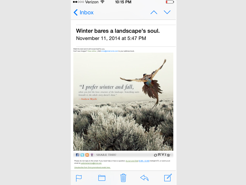
Here is an anomaly, and these are rare and brilliant. Patagonia and Orvis both do a good job with this very difficult type of e-mail promotion that may not convert to sales within a few seconds of opening it, but it sets a mood and establishes my set of beliefs surrounding the brand and their products.
Retailers usually don’t use these- and they usually don’t work for retailers. Brands usually use these to help establish what their brand is all about. What they mean, what they stand for. Again- this usually doesn’t convert immediately, but it will plant an effective brain seed to bring a customer back later. And, the other brilliant thing about this medium, a kind of visual “haiku”, is that it doesn’t mention prices. It only establishes image or cache’.
This e-mail will make me look back at Orvis again. If there is a good follow-on promotion, I may order. They got my attention, they did it with mood and imagery, and they kept price off the table for now. Winning.
Here is a train wreck. And it is real. This is from a big-box triathlon retailer. It is hopeless. Remember, 2 seconds… You’re driving your car, you’re sitting in an airport watching your flight get updated, you’re waiting in line at Starbucks, you’re at a drive-thru line and you’re quickly checking your e-mail. This shows up. Delete. Junk Mail.
This is words. Words, words, words, words. This is the guy who just talks too much. It plathers on about… something (I didn’t read it, it has taken less time to write this blog and I’m a busy man) and it has no point. It. Is. Just. Too. Long. Period.
Remember, this is how the e-mail showed up on my phone screen. This is one of the worst sales/promotional e-mails I’ve ever seen. This company has fallen into a trap of sending these and I collect them for just this purpose; to show people what NOT to do. I keep them because soon they will be bankrupt, again.
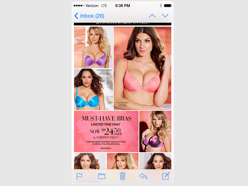
OK, get your mind out of the gutter. I know it’s tough, but try to focus on something other than the boobs. Just try.
Consider that you are selling a product category to a strong buying demographic: Young, affluent, high percentage of discretionary income, very fast moving, using lots of mobile gadgets and very connected. You need visuals. Rich visuals. Also, the product you are selling is visual-based. Sports cars, fashion apparel, anything with appearance as its key appeal. Like boobs. So you serve the visual of the product first and foremost. Copy??? Is there even copy on this page? I can’t remember. All I saw was pastel colors and appealing round things. I remember this from when I was born. I was screaming and hungry, and this fixed everything. Still does.
They could be boobs, they could be wheels, they could be food. It is a visual play for a visual product. And it sells. The brilliance of this approach by Frederick’s is they realize that men are a large percentage of their customers, buying apparel for their wives or girlfriends and, in the case of their better customers, both (at least temporarily).
This won’t sell to everyone. Some people will take offense. It is sexist. It is. But that customer isn’t a Frederick’s customer anyway and wouldn’t have received this e-mail. This e-mail shows the goods (literally and figuratively) and it will convert. Another thing about Frederick’s e-mail marketing is frequency. They keep boobs in your in-box daily. You never forget them.
That’s the quick and dirty on promotional e-mails, because promotional e-mails are a quick and dirty business. Especially when done right.
